 |
| Casa Smallville--Before |
 |
| Casa Smallville--After |
As I've said before, when we bought Casa Smallville, we loved the house. We did not, however, love the choice of paint colors used by the former owners. The kitchen was dark blue......sponge paint. I know! And the master bedroom; ah, what a thing of beauty. The bottom six feet of the walls were painted a deep dark, murky blue, while the top two feet were painted a shade of blue I will call battleship. Bridging the gap between hideous and hideous'er, was a wallpaper border with pineapples and fruit cornucopia on it.
 |
| The Hannibal Lecter Dining Room |
The day we moved in the house, I decided to see how much trouble it might be to removed the pineapple border. I saw one edge, near the door, had lifted up, so I gave it a tug. Imagine my surprise, when the border began pulling away from the wall with ease. It pulled away from the wall all the way around the room.
Why. you may ask?
The former owners had simply stapled the border to the wall.
I.Know!
 |
| The Nursery Dining Room |
The dining room, well, it was flesh colored, with some sixties, or early seventies, brass-and-glass light fixture in it. And since I am neither Hannibal Lecter or a Time Traveler from the past, I opted to make that my second painting job--after ridding the kitchen of the Navy blue sponge paint.
And I didn't want a red dining room because it's been done. So, I opted for blue. I selected a gray blue, called Oxford Blue, because it looked far different from the kitchen paint I'd just hidden away, and I instantly painted the dining room Oxford Blue.
And it looked plain.
So, I taped off stripes, and purchased some Oxford Blue in a satin finish, and went at the dining room again. I painted the wall below the chair rail the same color as the trim, so it might look better. And it did....until that first family dinner.
 |
| Aaaah, Green! |
Yes, it looked nursery.
Time for a change.
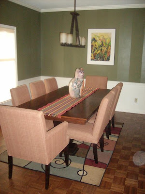
I went from Oxford Blue to a deep dark Forest Green, and when we bought the new dining table and chairs--in a color called Ginger--along with a new lamp, it looked beautiful, except....
 |
| Tape It Off. |
I missed the stripes.
Well, furniture was removed, measurements were taken, pencil lines drawn, tape applied, and then i hit it with the PolyCrylic; two coats. It gave every other strip a slight sheen, and gave some added detail to walls I already loved, because they were no longer flesh colored, or looked like a Little Boy Blue room.
Aaaaah, now on to the living room.
Now, to be fair, Carlos had his own painting project.
Shortly after we moved in, we had pot lights installed in the kitchen, a new fixture over the island, and one over the kitchen table.
With the removal of the old fixtures, the ceiling had to be repaired, and Carlos took that on. It had to be re-textured and then repainted. He did the re-texturing in record time....about six months.
The repainting? Well, that took a bit longer.
Three.Years.
Then, this past Sunday, out of the blue, he got out a ladder, some sponge brushes and paint, and painted the kitchen ceiling.
Three.Years.Later.
I couldn't figure out why he decided to do the ceiling, until I leaned the next day at Post Apocalyptic Bohemian--thanks Stephen--that Sunday was Michelangelo's birthday.
Now it all made sense.


Love the colors! Great job!
ReplyDeleteI don't even want to guess how long the kitchen ceiling as been On The LIST!!!
ReplyDeleteI love what you two did with the place. That is outstanding!
ReplyDeleteThat looks fabulous! Very impressive. I'm jealous. I tried painting my new apartment and it made me cry. I was SO bad at it. I ended up hiring a guy to fix what I had messed up.
ReplyDeleteThe green is definitely much better. Beautiful room! I really like the change you made on the exterior, too.
ReplyDeleteI love the stripes. I just painted my dining room artichoke green and now you've got me convinced that it needs the shiny stripe treatment. Oy. More work!
ReplyDeletep.s. The exterior looks great too.
Much brighter and warmer from the outside.
ReplyDelete