Showing posts with label Art Wednesday. Show all posts

Wednesday, October 20, 2010

Art Wednesday: Michael Quigg

I usually like to show off work by painters on Art Wednesday, but the minute I saw Michael Quigg's photographs I knew he was the one.


His work takes subjects that might appear depressing, dirty, violent, scary r sad, and he infuses them with brilliant color, creating something beautiful
Michael Quigg was born, and still lives, in Toronto:
"I have worked in graphic arts and photography for over 26 yrs. Freelanced for the Toronto Sun for 15 yrs. Have won several photo awards including City of Toronto – Best Fire Photo some of my images have been published in magazines newspaper’s and calendars, annual reports globally."

Michael Quigg Time Stands Still website

source

Wednesday, October 06, 2010

Art Wednesday: Noir Nouar


I'm all about whimsy, and Noir Nouar's work is as well. But there's an edge to the whimsy and a darkness and a danger, which makes her work all the more interesting, and the perfect choice for Art Wednesday.
from Escape Into Life:


Noir Nouar is a dark haired girl, with dark subliminal meanings and jolly palatable paintings. For example, you might think a robust shiny tomato lady is an enticing marketing icon; but three eager worms approach, their phallus shaped noses glowing red with excitement. A Bob’s Big Boy cameo also fits nicely in the genre of American advertising. But in the nude, he is a blatantly repulsive mascot for Fatty Happy Lard.
This is the precarious imagery that Nouar delivers in neat packaging, awaiting responses of repugnancy and giggles. She explores the nuances of food advertising, desire, anxiety, and good ol’ American tradition in all the glory of genetically engineered produce and milk fed veal. The contradiction between Nouar’s nauseatingly cheery characters and their imminent slaughter is at once silly and disquieting, a dilemma that has divided vegans, vegetarians, and meat eaters for all time.

Wednesday, September 22, 2010

Art Wednesday: Dena Shuckit


Aerial Event 3

I picked Dean Shuckit because she takes the horrid, and the awful, and somehow infuses it with color and life, and movement. It's all disaster, but from it comes change, and perhaps something new, better, and more beautiful.
Knuckle Under

Dena Shuckit:
I’ve been working on a series of paintings and prints, for a couple of years, now, loosely based on those lurid news photos that run next to daily headlines of urban and natural disasters. The pictures...are glorious, profound, and often far beyond comprehension--sublime in the classical sense of the word.

Hot Slag

Online news articles are often accompanied by entire slide shows of photos capturing the drama and dynamism of the disaster and the surprising and unplanned landscape that is the deconstructed physical manifest of these events.

Zagged

The activity of collecting and sorting stacks of these gathered pictures is a way of mapping my relationship to my landscape. My system imparts order to the mayhem. There is comfort in the rhizome of connections that emerges. Pattern, shape, color, and event overlap and repeat in a complex web charting the ebb and flow of civilization vs. nature.

Zagged 2

My hybrid landscapes chart loose and abstracted scenes of construction, destruction and that certain suspended chaos that often accompanies the two. My work decontextualizes the action from any specific urban disaster, instead drawing from the connections and repetitions I discover in the process of organizing the headline photos. Taken out of context, there is a raw allure and mystery--a beauty, even--in these source images that transcends the specific incident they’re connected to, or that even is unrelated to the event.

Wednesday, September 08, 2010

Art Wednesday

Amy Martino is a New York based Illustrator, Art Director and Graphic Designer.
Her work reminds me of Peter Max, but with an edge.
Whimsical, yet dark.


Check her out at Yellow Bird Machine.

Wednesday, August 25, 2010

Art Wednesday: Gregos' Street Faces


Paris is a magical city where you’ll come across some colorful and unforgettable characters. But perhaps the most colorful character of all is Gregos, an artist who has decided to make his face one of the most recognizable in Paris and elsewhere in France. He installs castings of his own face – basically painted plaster masks – on the walls of buildings, on mailboxes, and just about every available vertical surface in Paris.

Tourists in Paris may have noticed the unusual but eye-catching faces staring at them from the walls all around the city. Gregos began his strange quest to plaster Paris with his likeness in 2006. At first, the masks were blank and unpainted, featuring only a stuck-out tongue as their message to passers-by.

But in the beginning of 2009, the artist decided to make his faces more visible by adding bright colors and painted designs. There are mime faces, Kiss faces, clown faces, and a number of faces that interact playfully with their locations.

Overall, Gregos has installed nearly 170 faces in the streets of Paris, Lyon, Lille, and Malta Island. He places them in tourist areas to let plenty of people see them for free. The interaction that occurs between viewers and the masks is fascinating. Some people are put off by the faces floating out from walls, but most are amused.

It seems that the majority of passers-by are delighted to find one of Gregos’ masks, as evidenced by the huge amount of photographs tourists take with the faces. People pose with the masks, make silly faces back at the plaster likenesses, and carefully photograph the visages with their surroundings.

Gregos’ fun and strange art project has created a wonderfully weird kind of scavenger hunt in the streets of the City of Lights. Tourists who know about the art project are on the lookout for the masks wherever they go, and it must provide a great feeling of accomplishment to capture several of them in photographs during a trip to this stunning city.

Wednesday, August 11, 2010

Art Wednesday: Henri-Émile-Benoît Matisse


Henri Matisse wanted to be a lawyer, but while at school he was struck with appendicitis and he began to paint as he convalesced. He later said that it was in painting that he had discovered "a kind of paradise".

Crockery On A Table, 1900.

He gave up law school, deeply disappointing his father, and enrolled at the Académie Julian to study. Initially he painted still-lifes and landscapes in the traditional Flemish style, but in the late 1890s he visited the painter John Peter Russell, and Russell introduced him to Impressionism.


Woman Reading, 1894.

Henri Matisse's style changed completely, and he would later say "Russell was my teacher, and Russell explained colour theory to me." I'd say, given the marked difference between his early works, and those completed after visiting Russell, that we owe Russell a debt of gratitude. Matisse's early works were elegant, but simple; it's only his later works that seem to inspire thought and study and conversation.

The Moroccans, 1916

Matisse’s works approach abstraction, often distilling his images from photo-realistic paintings into shapes, shadows, and colors evocative of the human form. Matisse favored suggestion over detail, constructing bodies and objects from the sum of several carefully placed lines. The result of this ambiguity is an anonymity suitable to the indiscriminate killings Matisse would have witnessed during this time.

Greta Prozor, 1916.

As a 44 year old with a weak heart, Matisse was barred from serving in the French army in 1914. While contemporaries Georges Braque and Andre Derain fought in the war, Matisse remained at home, painting: “I sometimes emerge victorious, but winded,” he said, likening his artistic endeavors to a conquerable battlefield. He began to use sober blacks and grays increasingly, which may be reflective of the deterioration of Paris he witnessed and the gravity of his familial circumstances.

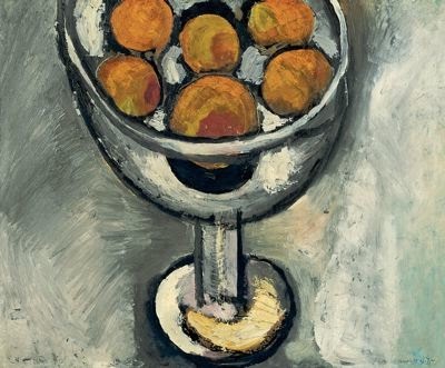
Bowl of Oranges, 1916.

Even Matisse’s neutral tones, however, are sumptuous and textured, a feat he achieved by layering, scoring, scuffing, and scratching his canvases, painting in a manner comparable to sculpture.

Goldfish and Palette, 1915.

Despite the reductionist nature of Matisse’s work from 1913-1917, x-rays have revealed up to seven layers of nearly completed paintings under his finalized canvases, indicating a purposeful frugality. The uniqueness of this period for Matisse is evidenced by his return to naturalism and conventionalism at the end of the war, when the artist relocated to Nice, France.

The Italian Woman, 1916.

While Matisse painted familiar objects, it is his style that became structural in the face of chaotic war. Late in life, he told an interviewer, “Despite the pressure from certain conventional quarters, the war did not influence the subject matter of painting, for we were no longer painting subjects.”

Wednesday, July 28, 2010

Art Wednesday: Jackson Pollock

Carlos and I watched Who The #$&% Is Jackson Pollock? which is the story of a woman, Teri Horton, who bought an old painting in a second-hand store for a couple of bucks and then learned it was an original Jackson pollack, worth up to $20 million.

Of course, she faced enormous difficulty in trying to prove it was a Pollack. The art community, read: snobs, don't believe that a Pollack could ever be sold at a second hand store, though that has happened before. The paint on the canvas was proven to come from Pollack's studio, and it even has Jackson Pollack's fingerprint on it.

But still, the naysayers say nay.

So, that brought me to Jackson Pollack for Art Wednesday because he was a master and a genius and a first.

He began to study painting in 1929 at the Art Students' League, New York, and by the 1930s, was influenced by the Mexican muralist painters--Orozco, Rivera, Siqueiros. It was, however, in the 1940s when he began painting in a completely abstract manner, and the `drip and splash' style for which he is best known emerged.

Instead of using the traditional easel he affixed his canvas to the floor or the wall and poured and dripped his paint from a can; instead of using brushes he manipulated it with, to use his own words, 'sticks, trowels or knives.'

Pollock's is mostly associated with the All-over style of painting which avoids any points of emphasis or identifiable parts within the whole canvas and therefore abandons the traditional idea of composition in terms of relations among parts. The design of his painting had no relation to the shape or size of the canvas--indeed in the finished work the canvas was sometimes docked or trimmed to suit the image. And that is what is believed to be the painting that Teri Horton found in the second-hand store--a cut off section of another painting.
On the floor I am more at ease, I feel nearer, more a part of the painting, since this way I can walk around it, work from the four sides and be literally `in' the painting.--Jackson Pollack
"Tea Cup"

"Fathom Five"

"Lavender Mist"

"Number 8"

"Shimmer"

Wednesday, July 14, 2010

Art Wednesday: Maurizio Bongiovanni

from Beautiful/Decay:

"Maurizio Bongiovanni’s paintings look like the effects of the past, or perhaps the future making its stamp on the present. But what makes Maurizio’s imagery even more effective is his choice of mundane subjects. Birds – sweet, chirpy, perched – suffering the effects of having fallen through refractive cracks… or their existence stretched as they fall toward some unforseen black hole?"