Okay,
so I'm still captivated by the more woodsy locales, but I'll get back to some
urban architecture soon, I think. But this
house grabbed me because it's got some hints of Frank Lloyd Wright working in
it, and I am nothing if I am not a Wright Whore.
This house, located
about 25 miles north of Seattle, is, or maybe a better word id 'was,' a 1950’s
Northwest Contemporary house, until it was completely renovated, though it
still maintains some of the Mid-Century Modern details.
The
original floor plan has been re-organized, with the main living and dining
spaces slightly enlarged, and a new, high windows added to bring natural light
to the entire space. There is a very spacious, light-filled master bedroom and
bathroom, each space surrounded by glass and trees.
The
kitchen is modern, with touches of iron and glass, and a full wall of windows
to take advantage of the scenery. In about half the house, the original hemlock
ceiling, with exposed fir beams, has been retained, and there were new fir
ceilings added to the rest of the house. The existing terrazzo flooring was
re-finished, with new areas of terrazzo added in a complementary color.
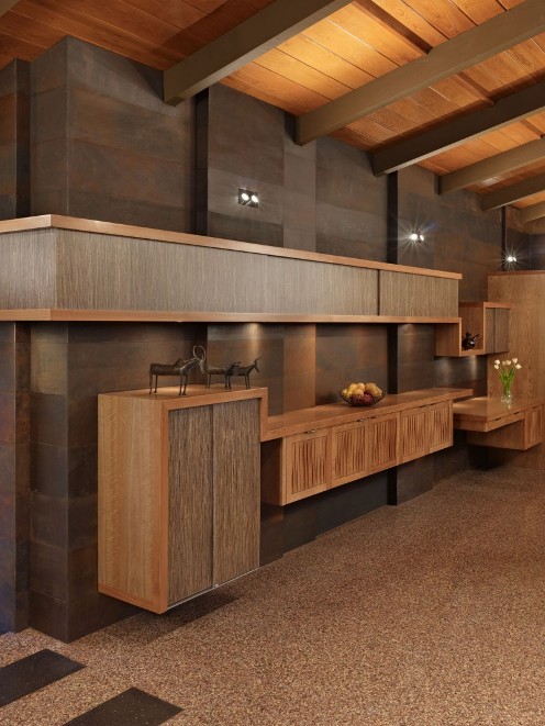
I love the woodwork,
and the built-ins, throughout the house, all crafted, primarily, of Cherry
panels; some of which are smooth while others have been milled with a router to
make a texture evocative of “woven wood.”
A 30-foot long
accent wall adjacent to the dining and kitchen areas has been clad entirely in
weathered steel panels and the suspended casework on the steel wall utilizes
either resin panels with natural grasses or textured cherry wood, both
materials set against the variegated umber colors of the steel.
The house, redesigned
by Finne Architects, pursued the idea of
“crafted modernism,” the enrichment of a modernist aesthetic with highly
personal, crafted materials and objects. Custom fabrications included the
cast-glass kitchen counter, steel wall panels, suspended steel mirror frames,
laser-cut steel shade valences, custom steel lighting bars, hand-blown glass
light fixtures, and a number of custom furniture pieces.
The glass wall
between the master bedroom and master bathroom has been transformed with the
use of a hand-drawn pattern in etched glass, with the pattern being more dense
at the bottom--for a sense of privacy--and increasingly transparent at the top.
Sustainable design
practices were integral to the project from the start with radiant heating
beneath the terrazzo flooring, high, clerestory windows to bring natural light
all the way into the house and motorized operators that allow for venting
during summer months.
Green materials,
like the resin panels, quartz counters, linoleum, low VOC paint, and
sustainable wood products, were also used in the project, but most of all this
renovation completely brings in new ideas about housing and energy while still maintaining
that sense of the 1950s.
I mean, if you want
to live among the trees, shouldn't you be kind to them?


The structure is a nice design but whoever decorated the place must have a phobia about using color. Everything's nearly the same shade of brown.
ReplyDeleteYes, very Wright-esque. Beautiful!
ReplyDeleteso dreamy
ReplyDelete