 |
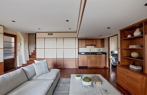
This stunning home built in 1933 was designed for the family of well-known composer and pianist Henry Cowell by the architectural firm Morrow & Morrow a few years after Irving Morrow designed the architectural components of the Golden Gate Bridge; the architecturally significant home has been designated Landmark No. 270 by the SF Planning Commission. While keeping its architectural integrity intact, the redwood plank-clad home has been thoughtfully updated throughout and boasts an impressive floor plan with large floor-to-ceiling windows that flood the interior with natural light and provide breathtaking views of mature trees, hills, and the ocean. The home spans four levels and 3,570 square feet with five bedrooms and four bathrooms. The main level showcases a gourmet kitchen, large living/dining area with custom cabinetry and original tiled fireplace, plus a study and remodeled bathroom. It also features beautiful mahogany floors, built-in cabinets and bookcases, 2-car parking, a large rear yard, and an exceptional roof deck with expansive, spectacular views. For a ninety-year-old house, she looks pretty stunning. Dwell |
Pages
▼


Those hardwood floors are simply stunning.
ReplyDeleteOriginal, too!
DeleteA lot of stairs, but when do we move in?
ReplyDeleteYeah, a LOT of stairs, but I love the house and I love that City!
DeleteIt's cool!
ReplyDeleteAnd has a unique pedigree!
DeleteThe dog's mother
ReplyDeleteLoverly views!
xoxo :-)
And lost of outdoor space to enjoy them.
DeleteOoh! Windows, windows, windows!! Views, views, views!! No negatives in the look...just too much space for me...if one of y'all buy it, I'll be happy to rent a room from ya! 😊
ReplyDeleteI do like all those windows and those views ... if I hit the Lottery this weekend, maybe I can spot you a bedroom?
DeleteI love this one. VERY cool. Especially those corner windows!
ReplyDeleteI am a sucker for a corner window!
DeleteAs I am now entering my annual hibernating months, this one is perfect for me (except for location). Love all the windows.
ReplyDeleteIt would make a cool hideout for the winter!
DeleteClarendon Heights?
ReplyDeletePerhaps, but I couldn't tell.
DeleteThis’ll do. I’ll bring the color palette with me when I move in.
ReplyDeleteI do think it could use some colorful art pieces.
DeleteWhat a beautiful home. That entryway is welcoming and leaves guests eager to enter. Love the widows. The views are lush. The interior is accommodating and the wood is just right. Not too light or dark. Of course, the outside spaces for lounging are great for morning coffee or a cool evening dinner.
ReplyDeleteThe windows and floors sold me, as did the area!
DeleteLove all the terraces and balconies! Great outdoor spaces!
ReplyDeleteSo many places to eat and relax and sleep and enjoy the views on the outside.
DeleteNope, couldn't do it. Despite all the wood, it appears sterile and cold to me. Now the outdoor spaces, that's a different thing altogether.
ReplyDeleteI'm not getting that at all ... but that means you and I won't get into a bidding war over this one! 😀
DeleteWith its small and understated street frontage, it is like an iceberg. The views from the rear must be stunning.
ReplyDeleteI agree; deceiving!
DeleteBeautiful, spacious, uncluttered and modern. What's not to like. And I agree you'd never guess this house from the exterior. Love it.
ReplyDeleteXOXO
I love the history of it, too, and the spaces inside and out.
Deletexoxo
This is one of the better houses you have featured!
ReplyDeleteGlad you liked it.
DeleteAmazing! I could be happy there. How many lifetimes would I have to work to afford that one?
ReplyDeleteThe one caveat ... the price. Damn that Lotto!!!
DeleteEven if I find the inside a bit clinical to my taste, that's an absolutely stunning house, isn't it!
ReplyDeleteThank you Treaders, clinical was the word I was looking for. I don't like this one.
ReplyDelete